Brand identity for B2B.
B2B brand work that exists to convert, not to win design awards (although Sqew picked one up anyway). Naming, identity systems and messaging frameworks built with the website and software they will live on, so the brand survives contact with real pages, decks and products.
What a B2B brand has to carry.
A consumer brand performs on a shelf and a poster. A B2B brand performs in rooms you are not in: procurement decks, comparison tables, forwarded emails and product screens. Every design decision we make is tested against those surfaces.
The procurement deck
Your logo sits in a grid beside every rival the committee is considering. The identity has to carry authority at 40 pixels wide, in greyscale, in someone else's template.
The comparison table
B2B buyers reduce you to a row: name, claim, price, proof. The name has to be findable, the claim has to be repeatable, and both have to survive being paraphrased by a champion who isn't you.
The website and product
Where the identity spends most of its life. Type, colour and messaging have to work as buttons, forms, tables and product screens, not just as a cover page. This is why we design on real components.
The forwarded email
The researcher who finds you is rarely the budget holder who approves you. The messaging framework exists so that whoever retells your story internally retells it accurately.
Brand built to convert the buyer.
Most brand projects end at the guidelines PDF. Ours end where the brand actually earns: on the website, in the product and in the sales conversation. That changes what gets decided first, what gets documented and where the work is tested.
Positioning before pixels
A defensible claim built from your sales reality and competitor set, written down and argued about before any visual work starts. If the positioning is wrong, the prettiest identity in the world just decorates the wrong claim.
Identity systems, not just logos
Type, colour, layout and motion principles documented as a system your team and ours can apply consistently, the same discipline as our web design systems. A logo file is an asset; a system is a capability.
Messaging frameworks
From the homepage headline to the enquiry button: a hierarchy of claims and proof in the language your buyers use, tested against real pages rather than a brand book vacuum.
Built where it will live
We design identity on real website components and product screens. SimpleFuel's identity shipped with its site; Cademi's rebrand shipped with a 3.4x lift in demo requests.
What happens, and when.
Positioning first, pixels secondFour phases, scoped per project and usually run alongside or ahead of a website build. The order is the method: nothing visual starts until the positioning is written down and agreed, because everything after it is argued from that document.
Discovery and positioning
Sales reality, competitor set and market map on the table. We run the Blue Ocean lens over your category - what every rival shouts about, what they all neglect, and where there is uncontested space you can own - and write the positioning down before anyone opens a design file.
Identity
Naming where needed (shortlists screened for domain and trademark conflicts at a practical level), then the visual core: logo suite, type, colour and the layout principles that carry them. Every direction is argued from the positioning, not from taste.
System and messaging
The identity becomes a documented system - type scales, colour pairs, spacing, motion principles - and the messaging framework is written on the StoryBrand spine: your customer as the hero, your brand as the guide, one clear plan and one clear call to action.
Rollout
The system is applied where it will actually live: website components, product screens, decks and templates. Because we build the sites and software too, the brand survives contact with real pages instead of dying in a PDF.
Blue Ocean for the position, StoryBrand for the message.
Two frameworks run through every brand project. Blue Ocean Strategy (Kim and Mauborgne) tells us where to compete: we map what every rival in your category shouts about, what they all neglect, and where there is uncontested space the identity can own, so you stop competing on the same factors and losing the same way.
Building a StoryBrand (Donald Miller) tells us what to say: your customer is the hero, your brand is the guide with a plan, and every message has to pass the grunt test - a stranger should know what you offer, why it matters and what to do next within five seconds. The full method is documented on our methodology page.
Map the category, find the space no competitor is claiming, and build the identity to own it - make the comparison table work in your favour before the design does.
Cast the customer as the hero and the brand as the guide, then structure every claim on the seven-part spine so the message survives being retold without you in the room.
A system, not a folder of files.
Five deliverable sets, itemised in the scope before you commit. Everything is documented so your team and ours can apply it consistently - the same discipline as our web design systems, because they are usually the same project.
Positioning and naming
The strategic core everything else is argued from.
Logo suite
The mark, built to work everywhere it has to.
Palette and type
The visual voice, defined once.
Messaging framework
What the brand says, from headline to button.
Guidelines and assets
The system, documented and usable.
Brands that shipped, and worked.
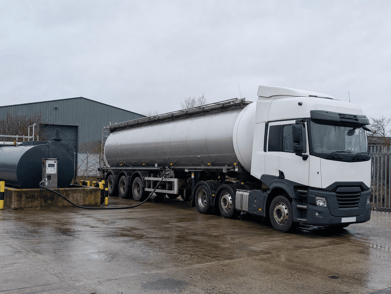
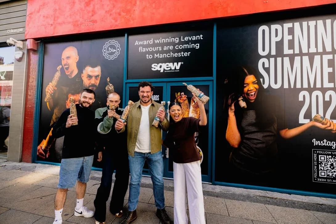
SimpleFuel’s identity shipped with its site as one coherent system. Cademi’s rebrand and rebuild produced a 3.4x lift in demo requests. Sqew’s brand-led build earned a 2026 Webby Awards honoree listing.

Is brand work the right engagement for you?
Asked before every brand project.
Positioning, naming where needed, visual identity (type, colour, layout, motion principles) and a messaging framework, delivered as a documented system with usable assets. Scoped per project alongside or ahead of a website build.